CASE STUDY
Millennium
Skate Customization Experience
Project Overview
My Role: Product Designer (UX/UI)
Timeline: 1 Month
Tools Used: Adobe XD
Project Type: Responsive website
Background: Millennium is a fictional skate vendor who is well known for its one-of-a-kind skates. Millennium's mission is to help revive skating as a favorite pastime—they target people who are both new and seasoned skaters. Millennium needs an efficient flow to help customers order a pair of custom skates online.
Challenge: Available online skate shops have cluttered and outdated digital experiences—making shopping frustrating and time-consuming.
Solution: Design a clear, easy-to-follow process for consumers to customize and order skates.
Research
I conducted interviews and created empathy maps to understand the users and their needs. I discovered that target users—new and seasoned skaters—find the online shopping process exciting, but overwhelming. Users mentioned being frustrated with websites that do not offer their style preferences or information about skate types.
Journey
Does not offer customization experiences that do not require contacting customer service
User Pain Points
Interaction
Outdated and hard to navigate due to broken links, contact forms, and buttons.
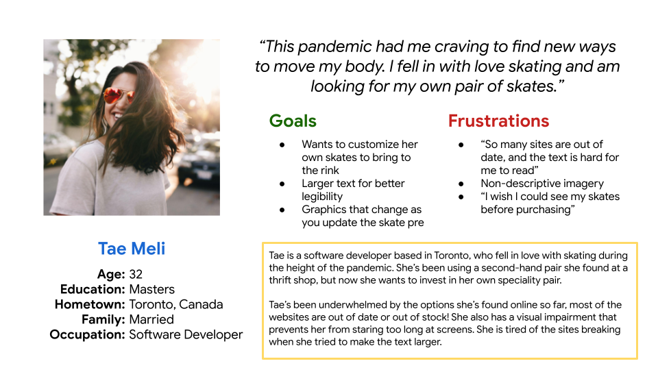
Persona and Problem Statement
Tae is a new skater who needs to easily customize specialty skates because she wants to order a pair that fits her style preference.
User Journey Map
I created a user journey map of Tae’s experience using the site to help identify possible pain points and improvement opportunities.

Ideate & Design
Sitemap
My goal here was to make strategic information architecture decisions that would improve overall website navigation while bringing familiarity to the structure. I designed with simplicity and effectiveness top of mind.

Paper Wireframes
Next, I sketched out paper wireframes for each screen in my app, keeping the user's pain points about interaction and overall experience in mind. I modeled the screens based on other top customization sites I reviewed during my competitive analysis.

DIGITAL WIREFRAMES
Moving from paper to digital wireframes made it easy to understand how the redesign could help address user pain points and improve the user experience. I kept my initial wireframes flexible because I wanted the design to easily change when going into user testing.


Usability Testing
I created a low-fidelity prototype—which you can view here— following the primary user flow of adding an item to the cart and checking out. This prototype was used in a moderated usability study with 5 participants. Below are the main findings uncovered by the usability study
Explanations
Users did not like the excess instructional text in the customization tool. 3 out of 5 said they would not read it before they begin.
Navigation
Users weren’t able to easily go back to the customization tool.
Checkout
Users mentioned not finding the ‘compare’ feature feasible to the business or useful at that stage.
Iterate & Refine
Mockups
Based on the insights from the usability study, one of the changes I made was removing the ‘compare prices’ section and replacing it with something more useful, like the “you may also like” section. This allowed users more relevant options to add to their cart without having them navigate through the entire site again.

Accessibility Considerations
Color
I used an accessible color palette builder to select the primary color usage on the site.
Typography
I selected headings with properly sized text for a clear visual hierarchy.
Image Labels
I added alt text labels for the customization experience for smooth screen reader access.
High-Fidelity Prototype
My hi-fi prototype followed the same user flow as the lo-fi prototype and included the design changes made after the usability study. I was very iterative in the design process to make sure the design was accessible while still impactful.

Challenges and Opportunities
The biggest challenge I faced while working on this project was time and lack of input. Since this is a ‘self-paced’ certificate course project, some things are beyond my control. However, I gave myself the real-life parameter of working with a stakeholder and setting a hard deadline. Generally, I do well with communicating and keeping a good pace in my process—whenever there seemed to be a setback I’d loop back with the project stakeholder to talk about the timeline.
Throughout this project, I questioned what would be feasible for the dev teams to create and build upon. As I continue to build on my practice, I would love to explore partnering with a developer(s) to receive input and improve on my design decisions.
Next Steps
Test and iterate on the hi-fi prototype to ensure the user flow and updates are comprehensive
Create the ‘What’s Your Skate’ Quiz pages to help users narrow down what skate type is best for them
Identify any additional areas of need and ideate new features.