CASE STUDY
OhYUM!
Celiac Safe Food App
Project Overview
My Role: Product Designer (UX/UI)
Timeline: 2 Months
Tools Used: Figma
Project Type: Responsive website
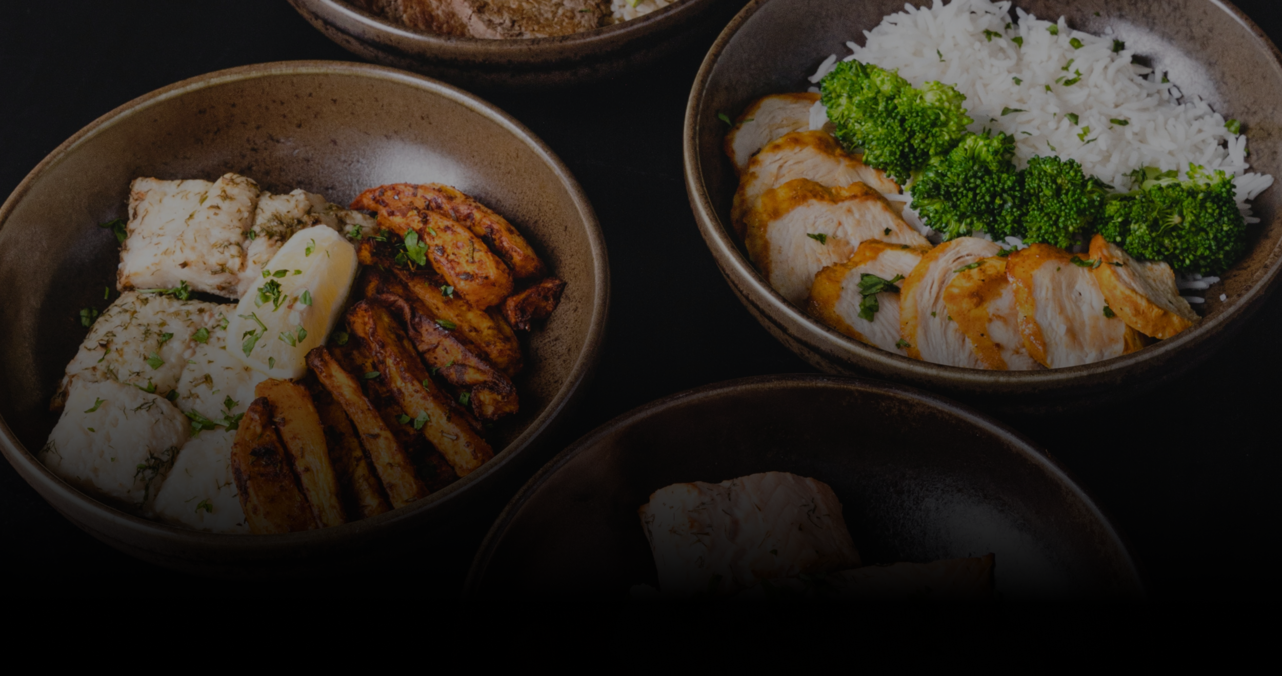
Background: This project is a love letter to my mother and other users with restrictive diets due to auto-immune diseases, in this case, celiac disease. OhYum! is a platform focused on providing safe food options for people with celiac disease. The primary target users include anyone with this diagnosis who would like to quickly find low-risk food options nearby. Think UberEats for celiac.
Challenge: People with celiac disease have to be extra cautious about the food they choose to eat, especially in restaurants and other eateries.
Solution: Design an app that will help these users eat sooner while lowering the risk of contamination and illness.
Research
I used my preliminary research and pre-testing conversations to develop questions for my user research. I found that a recurring pain point for all of the interviewees was the time it took to find and decide on food options to grab when they travel outside of their homes. Most interview participants reported feeling nervous when trying a new restaurant that claims to be gluten-free. This feedback made it clear that a celiac-specific app with proper language and search capabilities would be beneficial for this user group.
User Pain Points
Availability
There are limited safe fast/convenient food options available to people with celiac disease.
Risk
Most users reported feeling nervous when trying a new restaurant that claims to be gluten-free due to the risk of illness
Time
Users mentioned their frustration with the time it takes for them to eat while looking for safe food options
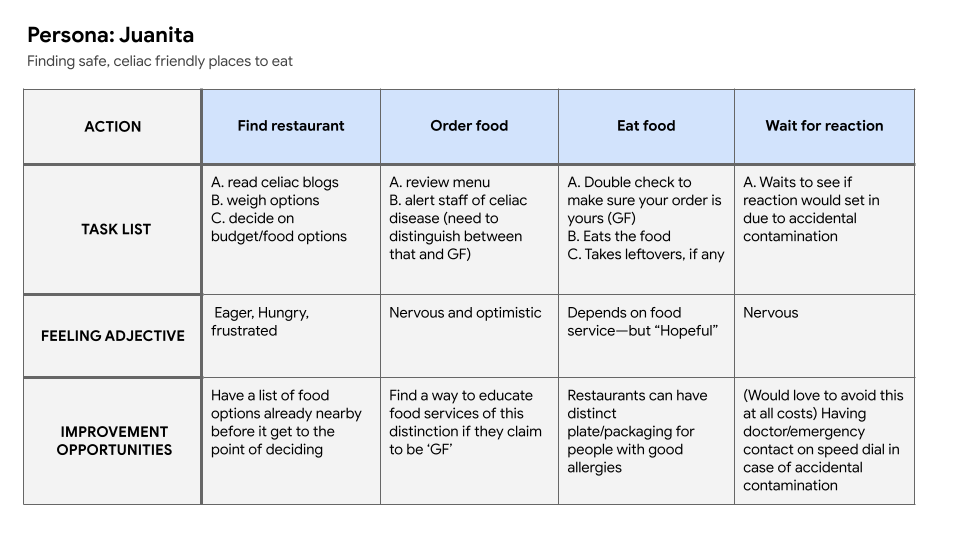
Persona and Problem Statement
Juanita is a person with celiac who needs to quick and easy way to find safe places to eat without making her sick because they like to travel and visit with friends and family.

User Journey Map
I created a user journey map to help me plan the best flow for a user like Juanita to take while exploring the product.
Competitive Audit
I created a simple audit profiling the FindMeGlutenFree App, UberEats, and Open Table as my direct and indirect competitors. I took down notes and screengrabs of the screens I found functional and used them to inform my design decisions.
Ideate & Design
Paper Wireframes
Based on my problem statement, I created a bunch of sketches to come up with ideas for how to address gaps identified in the competitive audit. My focus was specifically on search result functions and map screens.

Digital Wireframes
After ideating and drafting through the paper wireframes, I created the initial designs for the Food Saver app. These designs focus on delivering personalized guidance to users to help manage their food.

Usability Testing
Low-Fidelity Prototype
To prepare for usability testing, I created a low-fidelity prototype that connected the user flow of viewing a nearby restaurant and adding a food item to the cart. View the low-fidelity prototype here.
Usability Study: Findings
Save/Favorites
People had difficulty adding new favorite restaurants to their account, so they prefer it be added to the nav bar.
Define and Label
People want proper labels on restaurants to know if a place is gluten-free vs. gluten-sensitive
Iterate & Refine
Mockups
Based on the insights from the usability studies, I applied design changes like providing a clear section on the home screen that labels gluten-free vs. gluten-sensitive. I also added a ‘Favorites’ tab on the nav bar.


Accessibility Considerations
Color
High contrast color usage in branding
Screen Readers
Clear labels for interactive elements that can be
read by screen readers.
High-Fidelity Mobile App Prototype
The high-fidelity prototype followed the same user flow as the low-fidelity prototype, including design changes made after the usability study.
Responsive Design
Sitemap
With the app designs completed, I started work on designing the responsive website. I used the OhYum sitemap to guide the organizational structure of each screen’s design to ensure a cohesive and consistent experience across devices. Overall, I kept it short and sweet.

Responsive Designs
The designs for screen size variation included mobile, watch, and desktop. I optimized the designs to fit the specific user needs of each device and screen size.

High-Fidelity Desktop Prototype
“The OhYum! app brings me the confidence to try travel and new restaurants!”
— Usability Testing Participant
Challenges and Opportunities
I thoroughly enjoyed working on this project—working on a product that can have a positive impact on a community is a reward within itself. The main takeaway I learned was, that even though the problem I was trying to solve was a big one, I didn’t need to solve all of them! If I design, tackling one project at a time, then users have more enjoyable experiences without being bombarded with a bunch of unnecessary features for one simple app. My new mantra is “tackle it one problem at a time”.
Next Steps
Conduct research on how successful the app is in reaching the goal of helping users with celiac disease find food faster.
Explore partnering with restaurants on their gluten-free menu
Add a review tab and section on the mobile app and web platform